Building A Knowledge Graph of My First Semester in Medical School With 8164 Anki Cards
Getting straight to the point: here’s the actual knowledge graph. Each node represents a card (a piece of knowledge/factoid), and edges represent a connection between the cards (e.g., they’re the same subject, contain the same words, etc.). You can hover over a card to see the rough content. Drag around to change the perspective! If it doesn’t appear for you, try refreshing the page, or go to abhinavsuri.com/knowledge:
Now onto the post.
Background
Over the past few months, I’ve been working towards my MD at the David Geffen School of Medicine at UCLA. Classes actually started in September (after a month of covering basic sciences that were more or less done in undergrad), and I have been using Anki for my studying since then. For those not familiar, Anki is basically a flashcard application with some neat scheduling features built in to ensure that you don’t forget cards over time. In practice, this means that any card you look at on anki will show up again at some period later based on a spaced-repetition learning algorithm. Personally, I’ve found the Anki algorithm to be great for medical school so far (and about 108k other people agree with me as of Jan 2022) since it has minimized the amount of time I need to do a dedicated review for exams. To my surprise, the scheduling algorithm actually does work (though with some minor tweaks required for the massive amount of content associated with medical school), and I was able to do very well on my exams so far just by making sure I kept up with daily reviews (i.e., the cards that anki tells me I have to re-do) and doing practice questions provided by the school.
In addition to the in-house (i.e., school-specific) cards that I make for studying, I also use a compilation of decks made based on 3rd party resources called the AnKing deck. This deck contains 40,000+ cards based on popular study aids such as Sketchy, Boards and Beyond, Pathoma, etc, that are pretty much engineered to help with Step 1 prep. The predominant advice in the medical school anki community is to avoid making your own cards and rely on the Anking deck. However, since UCLA is currently undergoing a curriculum change, it was difficult to find cards that 100% correlated to what we did in class (e.g. for microbiology, we split it up by system instead of tackling it as one big block of content like other schools/resources do). Accordingly, I found myself using both resources.
Motivation

In a paragraph: Medical school can really seem like you’re drinking from a firehose, and there were definitely times in my first semester when it felt like that (@rheumatology, @hematology, @parts_of_microbiology). However, after a couple of weeks, my friends and I noticed that the content would suddenly feel connected to other bits of content we learn, making it much easier to remember. That notion of connectedness led me to actually see how “connected” all the different concepts we were learning about actually were.
In a phrase: boredom during winter break (and a need to do a fun CS project outside of research stuff and Advent of code…which became painful after day 19).
Plan
After some R&R during break, I noticed that I had reviewed over 8000 cards in Anki since starting school. More importantly, a lot of those cards had rich metadata associated with them. For example, cards in the Anking deck are tagged by subject. Furthermore, individual cards were formatted in a “fill in the blank” format (aka “cloze deletion”) that can easily be parsed to get out unique keywords/phrases. While I couldn’t quite include my anatomy and histopathology cards (since those were just images), it seemed like there would be enough to actually make a graph out of the remaining cards I had left.
Coding it up
Anki is a little bit weird regarding how it structures its data. All of the data seems to be stored in a SQLite database in ~Library/Application Support/Anki2/. There’s also a separate folder for application assets (i.e., the images associated with some of the cards). While I initially thought about having a graph visualization where you could hover over nodes and display the full card, it turns out that a) the images alone are around 6 GB (which is painful to host on a website, and b) some of the images are copyright protected since they come from the 3rd party resources.
But anyway, I needed to find some way to quickly get the data out about individual cards and the times they were reviewed (since I also thought it would be cool to visualize the growth of the graph over time…which didn’t work out in the end). While I am a fan of python’s sqlite3 library, it turns out that someone already made a nice handy library (called AnkiPandas) to convert an Anki database over a pandas dataframe.
Let’s walk through the code:
from ankipandas import Collection
col = Collection("/Users/abhi/Library/Application Support/Anki2")
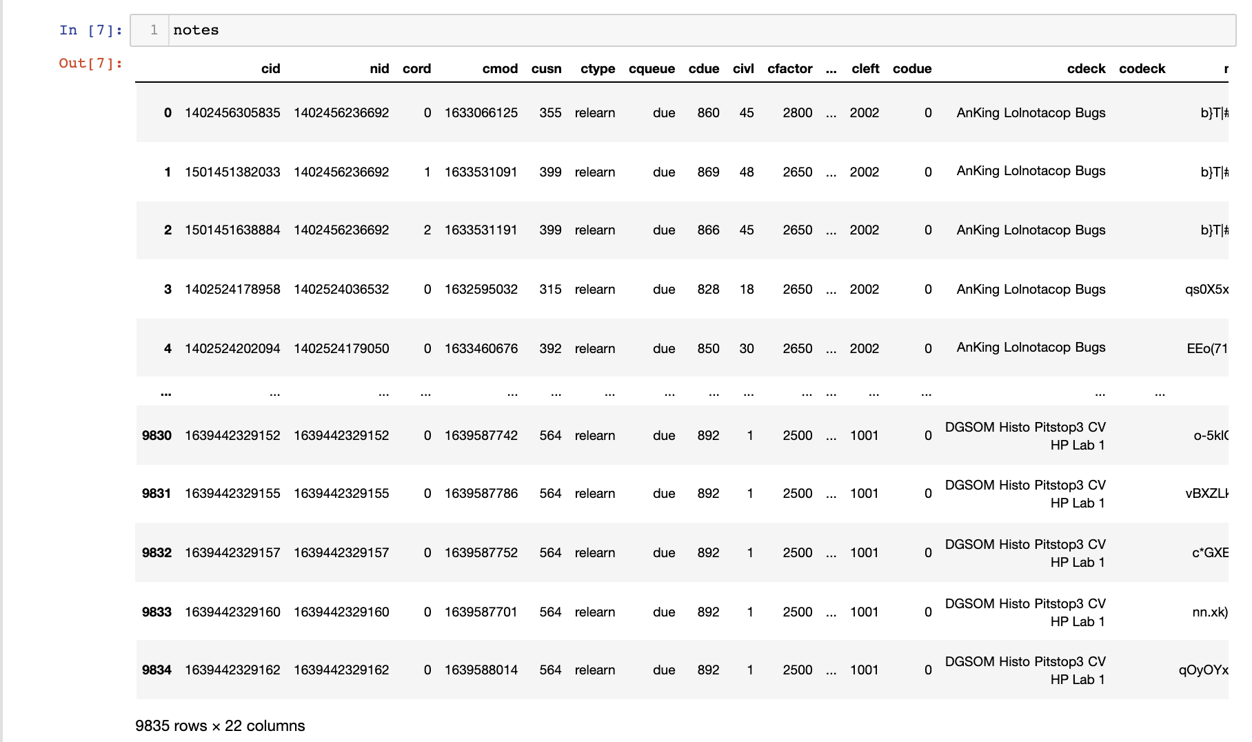
nonsuspended = col.cards[col.cards['cqueue'] != 'suspended']
notes = nonsuspended.merge_notes().reset_index()
Going through line by line: Line 1 is just importing a Collection class that handles instantiating the database connection to the Anki sqlite db so long as you pass in a path to the general folder it is located in (line 2). Note: It is imperative that you actually quit your Anki application while this script runs (since you’re otherwise going to lock the db). Line 3 just gets me all of the cards that are unsuspended (i.e. things I have actually reviewed) and line 4 merges in notes associated with each card (which contained all of the metadata).
revs = col.revs.reset_index()
notes.merge(revs, how='left', left_on="cid", right_on="cid").to_csv('out.csv')
I also merged any review events associated with the cards (line 1) and left join to the notes data frame created earlier (the card ID cid as the join key). In the end, I get a fairly large data frame:
Extracting Metadata
This next step was to actually get data from the individual cards. I won’t put the code for that over here since it is really messy (and you can find it on my Github), but the general idea is as follows:
def cleanhtml(raw_html):
    CLEANR = re.compile('<.*?>')
    cleantext = re.sub(CLEANR, '', raw_html)
    return cleantext

def process_fields(row):
    row = row.strip('][').split(',')
    tags = []
    try:
        pattern = re.compile(r'\{\{.*?\}\}')
        match = pattern.findall(row[0])

        for m in match:
            prelimtext =  m.split('::')[1]
            if 'img' not in prelimtext:
                s = cleanhtml(prelimtext).replace('}}', '')
                if len(s) > 4:
                    tags.append(s.lower())
    except:
        pass
    return list(set(tags))

def make_tags(row):
    try:
        tags = [] # dummy variable from failed experiment...ignore
        fields = process_fields(row['nflds']) # handle ClozeFields
        other_tags = []
        # handle my cards
        if 'DGSOM' in row['cdeck']:
            if 'faces' not in row['cdeck']:
                other = row['cdeck'].replace('\x1f', ' ').split(' ')
                for o in other:
                    if len(o) > 3 and ('DGSOM' not in o):
                        other_tags.append(o.lower())
        return list(set(tags + fields + other_tags))
    except:
        return []

notes['tags'] = notes.apply(make_tags, axis=1)
Basically, the logic is to make a list of tags for every card. I apply the make_tags method to every row in the data frame. I use two sources to get tags: the first is the “fill in the blanks” (cloze deletions) present on each card; the second is the deck title.
-
Cloze deletions are set up in a relatively predictable manner. Looking at the individual fields of a card (just basically all the content of the card encoded as text which is in the
nfldscolumn of the data frame), we can look at the first field (the text of the card itself) and match against cloze deletions. Cloze deletions are formatted in the following manner:\{\{cloze_identifier::answer to fill in the blank::optional hint\}\}(e.g.HbF has a \{\{c1::higher::higher vs lower\}\} affinity for O2 than HbA). I then added the answer to the fill in blank to the tag list. I also had to get rid of any html tags (mainly image tags) in the cloze deletions (which is accomplished using theclean_htmlmethod). All of the above is accomplished in theprocess_fieldsmethod. -
For any self-made cards (ie those that have a title containing ‘DGSOM’), I went ahead and actually added the deck title words as tags as well since sometimes the cloze deletions were not text (i.e. were images) or were very nonspecific (e.g. “yes”, “no”, “higher”, “lower”, etc). That’s all handled within the
make_tagsmethod.
Making the Graph
So now we have a list of nodes with each with their own list of attributes. To make a knowledge graph, we need to actually construct a graph! Unfortunately, I wasn’t able to find a super-efficient way of doing this. Ultimately, I handled it using this method (using the networkx package in python to handle graph logic):
G = nx.Graph()
s = set()
for index, row in notes.iterrows():
    if index % 2000 == 0:
        print(index, G.number_of_edges()) # just for debugging
    new_node = row['nid']
    new_attributes = row['tags']
    if new_node not in s:
        s.add(new_node)
        G.add_node(new_node, my_attributes=new_attributes)
        for node, attrs in G.nodes(data=True):
            if node != new_node:
                added = False
                for attr in attrs['my_attributes']:
                    if attr in new_attributes:
                        if added == False:
                            G.add_edge(node, new_node)
                            added = True
                        else:
                            break
The method is relatively self-explanatory. For each of the new nodes we haven’t added yet, I add a node to the graph with attributes equal to the tags for the individual node. Then for all the other nodes that exist in the graph at that point, I check to see if there should be a connection from the new node to existing nodes in the graph (by looping through the attributes of the considered node and new node). I break early if there’s an edge added since it really makes the algorithm faster.
Optimizations with Minimum Spanning Trees
On first pass, the graph had 8167 nodes and 10,229,426 edges. I knew that it would be nearly impossible to visualize 10 million edges in javascript. I also experimented using software like Graphia and found that it took far too long to parse the graph.
So I needed some way to cut down on the number of edges while still keeping the idea of “connectedness” of concepts. Ideally, the solution would need to be able to keep the same number of connected components and connect all the vertices of course.
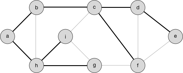
I remembered from my algorithms course that a couple of algorithms dealt with this problem, though in a slightly different context (ie a weighted undirected graph rather than a non weighted undirected graph). Upon some further research, it turns out that Prims and Kruskals could still create a minimum spanning tree (which is exactly what we want; see figure below). It turns out those algorithms I learned in CIS 320 at Penn actually were useful!
NetworkX already has an implementation of an MST algorithm (kruskal’s by default) that neatly handles everything, so running it was as simple as 1 line of code:
G = nx.algorithms.tree.mst.minimum_spanning_tree(G)
I also went ahead and got rid of some connected components that were smaller than 5 nodes since these likely represented image cards that have no metadata information on them:
for component in list(nx.connected_components(G)):
    if len(component)<5:
        for node in component:
            G.remove_node(node)
In the end I got 6785 nodes with 6773 edges. That seems within the realm of what can actually be handled in the browser!
Export and Visualization
While learning D3 has been on my to-do list for a long time, by the time I was at this stage, the break was coming to an end, so I started looking for a library that would handle network visualization for me using a force graph. Thankfully, this library existed: https://github.com/vasturiano/3d-force-graph. All it really needed was a JSON file with the nodes and edges listed.
NetworkX has a nice helper method that exports a JSON representation of a graph:
jnew = json_graph.node_link_data(G)
And then, I went ahead and edited the json to include data on the actual card text itself + the last time it was reviewed (to give the network visualization library something to use for color coding). After adding those attributes, I exported the json to a file. Note: simplejson was really helpful considering that json.dumps does not handle NaN in python for some reason and leaves it as a bare value in the json…which is invalid JSON…I don’t know why that’s a thing.
for idx,n in enumerate(jnew['nodes']):
    note_orig = notes[notes.nid == n['id']]
    time = note_orig.iloc[0]['rid']
    note = note_orig.iloc[0]['nflds'].strip('][').split(',')[0].replace('\'', '')
    jnew['nodes'][idx].pop('my_attributes', None)
    jnew['nodes'][idx]['note'] = note
    jnew['nodes'][idx]['time'] = time

import simplejson
with open('out_clean.json', 'w') as outfile:
    d = simplejson.dumps(jnew, ignore_nan=True)
    outfile.write(d)
Anyways, I then wrote up a simple html page with the code to visualize the graph (all it needs is just some simple configuration of the library) and then we’re set.
<head>
  <style> body { margin: 0; } </style>

  <script src="https://unpkg.com/3d-force-graph"></script>
</head>

<body>
  <div id="graph"></div>

  <script>
    fetch('out_clean.json').then(res => res.json()).then(data => {
      const elem = document.getElementById('graph');
      const Graph = ForceGraph3D()(elem)
        .backgroundColor('#101020')
        .nodeAutoColorBy('time')
        .nodeLabel(node => `${node.note}`)
        .linkColor(() => 'rgba(255,255,255,0.2)')
        .graphData(data)
        .zoomToFit();
      });
  </script>
</body>
Analysis(ish) & Overall thoughts
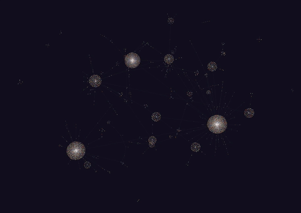
Honestly, this looks really amazing. I never really thought I’d be able to get a decently connected graph, but it turns out that the amount of meta data on the cards is really good. Though this isn’t quite everything (since it is 6785 nodes out of the full 8000+), it seems to capture a lot.
It looks like the largest components of the graph were all anatomy and histology based. This makes sense since we covered a lot of material in both of those fields, including the following:
- Histopath: basic tissues (layers, connective tissue types, epithelia types), basic dermatology (skin layers, inflammation, and neoplasias), cardiovascular, bone, cartilage.
- Anatomy: Neuro (Cranial Nerves, Eye/Extraocular muscles + some vasculature), musculoskeletal (this was the roughest…4 weeks of content), and cardiovascular.
Other large components of the graph included MSK. A lot of the smaller ones were for smaller subjects such as rheumatology, microbiology, biochemistry and immunology which we haven’t really covered quite yet.
Interestingly, there’s a lot of mixing in the larger nodes, indicating that some of these concepts are connected (or some random tag is connecting these things all together).
Some future steps for the project include figuring out how to animate the addition of new nodes (it’d be great to see a progression of knowledge graph growth).
For anyone else who wants to do this, the code is up at https://github.com/abhisuri97/anki-analysis.
Anyway…time to get back to reviewing.